Showing posts with label Websites. Show all posts

Tuesday, 13 October 2015

Web Hosting for Artist Websites

For years I have had a Dreamweaver built website that a web designer set up for me. I learned enough Dreamweaver to maintain and update it and redesign parts of it. But it was cumbersome and time consuming to update. If something went wrong with the script or programming, then I wouldn't always know how to fix it beyond cutting and pasting from another page and hoping the problem would disappear. Mostly it did. Sometimes it didn't. Until lately when I couldn't even upload changes.

Years ago I looked for a clean, free web host in order to set up a site for another artist who made small scale sculptures. I couldn't find anything I thought looked professional and minimal enough. When I looked at paid websites I still couldn't find anything decent. There seemed to be a hole in the market. I had an idea 10 years ago that this was a brilliant business opportunity if I could only find a web designer to work with me. Then I could design the layouts and they could do the programming. Now, 10 years later I actually need the website for myself and am surprised at what I find.

I read an excellent article in my web search written by a web designer. He maintained that there were only two places he would recommend a visual artist use: Wordpress and Squarespace. He wouldn't bother with any other. When I ask artists what they recommend it is always Squarespace that comes up. Both Wix and Weebly come up now and again too so I thought I would explore these as well. But I am sort of stuck on the idea of using Wordpress.org because it can be free and I would have 100% control.

I looked at Wix and Weebly to begin with as they were the last options on my list. They are both paid and I am not sure how easy and uniform they are to maintain an artist website with 10+ bodies of work. If I am going to pay, then I might as well use the one designed for artists (Squarespace). I crossed them both off my list despite thinking maybe I should build a website in each to test them all (I obviously don't know how much work that is).

Wordpress.org is my first option (not to be confused with Wordpress.com) and I found a free theme that seemed to do almost all of what I want. Responsive Theme: Hatch (see below).


So I download Wordpress.org and the Hatch template. I have two folders for each on my desktop which I open. I am looking at programming files in each. What is this? I have no idea what to do with them. Yes, I can watch videos and read tutorials and learn, but if I can't intuitively figure it out quickly, this likely will take up too much of my time. Besides, I need a new website finished in a month and my time is tight within that window.

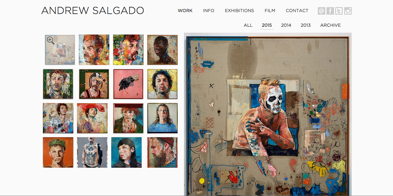
I immediately go to Squarespace.com to check out much closer what they have to offer. The Avenue template is what I visually like the best. (see below)


What are my top goals for a website? 
-Clean, professional, minimal that can showcase my art and make it look really professional.
-Free if possible or almost free.
-Easy to use and possible for me to build and maintain myself.
-Somewhere I can port my domain to.
-A responsive site (it resizes for different devices and therefore does not get downgraded by Google search engine).

After choosing Squarespace I realise I also need some further things they offer:
-A built in Google Analytics.
-A built in Google search thingy (where you put in the key words and it makes the search engine work for you).
-An easy way to add galleries, videos, photos, etc..
-Web support.

Downside? 
-No domain email capacity. I signed up with Zoho Mail (free) and have just got all the kinks ironed out for IMAP/POP mail.
-Templates can be a bit limited, but for the sake of the ease of the rest, it is workable.
-It is not free. I am the consummate starving artist always looking for the cheapest. The good news is it is cheaper than my last hosting plan.

Would I recommend Squarespace? 
Quite frankly I think it is the only option out there for artists. It is what I would have liked to have come up with 10 years ago when nothing like this existed and there was that black hole in the market. But looking at what they have achieved, I would have had to give up my creative job in order to built such a successful empire. Go Squarespace! 

Most artists that I know hire web designers to set up their Squarespace website. But I am determined it must be easy to do myself. It takes me a good whole day to figure it all out, googling how to do things the template doesn't naturally do. But I do it and now I know how it works and I can control it and maintain it (and change templates anytime I want to). 

The price I figure is less than I was spending at my previous host (doteasy.com). Currently Doteasy holds my domains (michal.ca/michaltkachenko.com), Squarespace hosts my website (michal.ca), and Zohomail hosts my domain email (michal@michal.ca). 

Note: you can Google Squarespace voucher codes and get 10% off the first year. I did and I think I paid about $86 for the year on top of the domain. 

Tuesday, 6 October 2015

Websites for Artists: Content

Content is the next thing to consider in an artist website. I do think less is more. The further I go along, the more I think that less is actually more striking and professional looking. There is a fine balance of course. Pages in your website can include New Work, Work/Archives, CV/Bio, News/Exhibitions, Contact/Newsletter/Representation and I am sure there are more depending on different things artists have done or are involved in. I am a painter so I am aiming at what I have done. In my recently revamped website I have merged previously separate headings to come up with only 4 pages.

My most important idea for my website is my homepage, New Work. I want all my latest series in thumbnail format to be viewable as soon as you are on the home page. A single new work (see Laurie Steen's front page below) can also look very clean. But what is going to bring a viewer back to my site time and time again? Only something that is always changing. Artists' websites are notorious for being so static that you rarely have to visit more than once every few years. So if I can change the series I have on the front page every month or every few months and include the link in a quarterly newsletter then I can increase my traffic and hopefully keep my work in people's memories. Another good idea is to have your most recent upcoming exhibition on the front page.

Speaking of traffic, who am I aiming my website at? firstly, galleries that I market to. I want them to find my most recent work immediately when they arrive at the home page and be able to easily follow a path to cv/bio, etc. The more work I make them do the faster I will lose them. Easy, simple and clean is my moto. Secondly, I am also aiming my website at people who follow me and my work, buyers, fans and friends who support me and want to know what work I am doing and where I am exhibiting next. 

Your Biography/About page is statistically the next most visited page in a website so it is key. I have now combined my CV and Bio on that same page. Again, my aim is to really simplify my website and make it extremely easy for people to get around and not have to endlessly click. The more you have to click on a new page the more viewers you lose. And to be a bit cheeky and add a bit of a hidden surprise, a link to this blog is partially down the page. I am not keen to advertise this blog as a fully functioning member of my website given who I am aiming the website at. But I don't mind some people finding it and following the link out of curiosity. It is meant to be a hidden thing. The "behind the scenes", no-bullshit-about-being-an-artist blog.

Your other or older work is next. I am trying to figure out a way to show my land based paintings, my figurative work and my interiors/food paintings all in one go. I don't really want to make people choose between genres and click to separate pages. My thinking was originally to not even have old work. Once the new stuff came, the old was gone. But then an artist pointed out that people want to see the work I am talking about having done in my bio. So perhaps I will choose the best of the past series and include them on a "work" page. This I have yet to include on my site. Above is a nice clean example of exhibiting a lot of small images. Michela Sorrentino had some really nice page layouts. And I am almost certain she used the Avenue template in Squarespace as well.

I decided to combine my CV and Bio in my recent website update. My bio is quite short and my CV is quite long. What I need to do next is really edit down my CV. I need to have the headings Selected Solo Shows and Selected Group Shows and edit it down even more to the most impressive galleries and exhibitions. When you are starting out, you don't edit it down, just so you can get a CV going. Then you try to edit out the beginner type shows and carry on from there.


The two images above are a really nice layout for a News and Exhibitions page.  In fact, I copied Michela's layout in my website I thought it was so effective. http://www.michal.ca/news/ Image on one side and info nicely laid out on the other side in the same format for each item. I also really like how she puts the month and year above each for a very fast glance as to generally when the events are.

A really nice shot of Michela's home page. Each image toggles through different images. Very clean.

Lastly, for me, I have a page for my contact details, newsletter signup, and gallery representation. I currently have only 4 pages on my website which I think is great. But I am going to add a Video page for an upcoming e-course I have filmed, a Works page for older work and who knows what else as I get further along.

All in all, I think the aim of my own website design is to be as clean and simple as possible. To have as little clutter or extra pages to click to. To look extremely professional in layout, work, cv, and exhibitions. This is one of the most important tools nowadays for artists and really says a lot about an artist and where they are in their career.

Afterthought: when I initially wanted to write about website content I think I had a much more specific aim that I was wanting to get across. Now that I waited a few weeks to finally write it, I think I have lost the main aim of what I had been keen to get across. Oh well. Maybe it will come back to me and I can write a post-script addition to this post.


Tuesday, 29 September 2015

Websites for Artists: Style

I have been in the research stage of a new website for a few years now (most intensely in the last half year) and have picked the following as my favourite artist websites for very specific reasons. My top choice is Andy Denzler (see next 3 images). The 4 images that his front page flips between are so impressive. His site is clean (the new lingo that describes a minimal, uncluttered site), devoid of extra distractions, logos, fancy fonts, etc..


He has honed his sidebar down to the essentials. He only shows his latest series of paintings, drawings, and sculptures. This is difficult for artists to do, including myself. One always want to parade everything one has done in the past so that people know what we are capable of. But the weakness in that is that the older your work, often the weaker, more obsolete, more juvenile it can be. At least in my case that is true. I am continuously cutting out the oldest work from my site. Even I don't feel I cut enough.


Another installations shot that the front page shows.


Here I have clicked on Andy Denzler's paintings page. The work appears in small thumbnails, easy to see and one can click on them for an enlargement. It is simple and effective. If I had full control of a site like this I would get rid of the lines around each work and make sure each series fit on one page, not having to toggle through more than one to see all the thumbnails.


I only recently came across Hillary Kupish's site (above). This is the last word in minimal and clean. I absolutely loved it so much that I even thought of going this minimal for my own site. Unfortunately I couldn't fit much in if I did. Although I have cut and amalgamated different elements in my new website, I could not get it anywhere as minimal as this fantastic site. This is a great site built in Squarespace with the Supply template.


Cybele Ironside's  site works so well. She has a single series on her front page and each time  you click on one image it enlarges and the rest remain visible in thumbnail underneath as you scroll down. A sharp looking site built in Squarespace using the Avenue template.


Michael Smyjewki's site is also the Avenue template in Squarespace. This template seems to function really well for designers like Michael. He has each square sample on the front page expanding into a scrolling downward gallery (blog-like) that continues on the theme of that one thumbnail. I wasn't sure how this would work for artists who might have 15 images. I don't want to have to scroll through a long body of work.


Then I clicked on Michael's "photo" link and saw there were other ways to display work. Again, he chose the grid gallery, but when you click on one of these you get a light box that enlarges only one image at a time.


Charlie has been one of my favourite local British artists. She recently had her site redone by web designers and it looks great. She uses the single "impact" image on the front like Andy Denzler does, you can click to her gallery grid page. It wasn't until I designed my own site on Squarespace using the Avenue template that I realised that is exactly what her web designers have used for her. 


Andrew Salgado has the template look I was searching everywhere for. I was ultimately looking for a grid on one side and an enlarged image of whichever thumbnail you clicked on on the other. This has alluded me to this day. I like to keep it all simple and all visible at all times. This site does exactly that. 


Finally, Mario Hugo had such a beautiful and innovative site that I just had to include it too. It really works for designers, I am not sure it would for artists.


I took an excellent workshop run by the web designers, prettysmartsites.co.uk, at the City Business Library in London, UK, which was excellent. It was entirely aimed at the small business. Most of the common sense advice given worked for an artist's website. Here were some of their ideas:

Qualified Traffic + Well-Optimised Website = High Rate of Conversion.

WHAT MAKES A GOOD SITE:
-Easy to manage
-Presents company in good light
-Attracts Traffic
-Converts Traffic to sales/sales enquiries/other types of conversions (newsletter sign up for me)
-Pays for itself

How will I bring traffic to the site?
Who are main competitors and what are they doing?
What is the image you want to create?
What is purpose of site and overall aim?

SOURCES OF TRAFFIC?
-Search engines
-Online ads
-Web properties (ie. blog, tumbler),
-Social networks
-Other websites (ie. twitter, pinterest, Facebook, twitter)
-Print Materials (leaflets, business cards)
-Real World (networking)

Every page is a door (add images to cv/bio, etc). Blogs are excellent as they are always changing and adding new content. This is good for repeat traffic as well as Google rankings. Every page must have a goal to fulfil (sales funnel: blog on icons>view icons>prices). Every page needs a call to action (to buy, request a call, download, fill in contact form, or select another page to view).

DON'T
-Use others' images
-Bury content in Flash (flash is not compatible with iPhones or iPads. Recently Google also has downgraded any site that is not responsive, meaning the layout does not adapt to different devices like mobile phones)
-Use music/ videos that start on the page load (very intrusive)
-Use splash page/ Flash intro
-Force downloads or plug-ins to view content
-Ask too many question in Sign In box (name and email max)